InPower
Creating a safe space in a digital world.

CLIENT
InPower
ROLE
Product Designer
DURATION
5 Weeks
SCOPE
UX Research
Ideation
Information Architecture
UI Design
Wireframing
Prototyping
Testing & Iterations
The Process

Before diving into the details, l'd like to outline the steps taken throughout this project. Beginning with empathy, the design process is rooted in collaboration and shaped by continuous iteration and refinement, with the goal of creating an intuitive, accessible and impactful digital experience.
Empathize
Researching the problem & understanding the target market
InPower’s overall target market aims to eventually be inclusive of all users, but currently they are focusing on young girls, women and non-binary individuals, ages 13+. I wanted to better understand this target market, specifically in reference to their feelings surrounding chatbots and AI.
Creating a competitive analysis for a closer look at the competitive landscape
Before delving further into understanding our users, I first wanted to get a better grasp on the current market of competitors and their usage of chatbots and AI. Conducting a competitor analysis afforded me with valuable insights and allowed me to investigate industry trends, visualize user expectations and identify feature gaps. I explored general AI-based chatbot competitors, as well as those more focused on user mental health.

Conducting user interviews to understand how users feel about chatbots & AI
Knowledge
Understand how much knowledge users have about chatbots and AI.
Usage
Determine the reasons behind why users utilize chatbots and AI.
Implementation
Understand how users implement chatbots and AI in everyday life.
Features
Discover what features users enjoy or expect when using chatbots and AI.

Biggest takeaway: The number one concern for users is privacy & data security
A recurring theme was that users felt hesitant to share sensitive or personal information with a chatbot unless they were certain their privacy and data were fully protected.
Key Findings
While the majority of participants mainly utilize chatbots and AI as a tool to help with daily tasks or for educational purposes, they could see the value in a chatbot that can show empathy and provide support as a mental health tool. Participants also like the idea of a chatbot that can learn from their interactions and cater to their individual personalities and needs; however, they distrust chatbots that are too personified and wish to be clear on boundaries. Users are also more likely to trust the advice of the chatbot if they know that it is trained by licensed therapists and psychologists.
User Pain Points
Participants were unanimous in their desire for privacy and data security policies to be fully transparent. They expressed hesitation about disclosing sensitive or personal information to a chatbot without strict privacy regulations in place. Participants also expressed a general fear of becoming too reliant on AI, both as individuals and as a society.
Actionable Insights
Now that I have a better understanding of my users, I can focus on the following actionable insights to help inform my design decisions moving forward:
Setting assumptions aside
One of the biggest challenges I faced with this project was having to set aside my assumptions and stay neutral despite my own personal opinions surrounding AI. It was important to stay unbiased in order to fully learn and understand my users.
Define
Building user empathy with user personas
My competitive analysis and user interviews provided me with a better understanding of who my users are and what problems they face. In an effort to turn my research findings into concrete visualizations, I created two user personas to help me empathize with my users and understand their needs, motivations and pain points.


Brainstorming solutions with POVs & HMWs
The big question:
Ideate
Turning user needs into features
With my POV and HMW Questions helping me to better understand the problems and needs of my users, it was time to turn those user needs into product features. Keeping my research and user personas in mind, I created a product feature roadmap which ranks features from high to low priority. Each feature was thoughtfully designed to enhance the user experience while meeting user expectations and goals. View below or access the feature roadmap here.
Crafting an intuitive experience
In order to craft an intuitive experience for InPower users, I wanted to create a user flow that illustrates the journey users take when interacting with the chatbot. From launching the bot to engaging in conversation, the user flow maps out user interactions and highlights potential pathways in order to ensure a seamless user experience.

Prototype
From sketches to low-fidelity wireframing
With my user flow mapped out, it was time to put pencil to paper. I started by sketching out various ideas and concepts before moving to Figma to create low-fidelity wireframes.
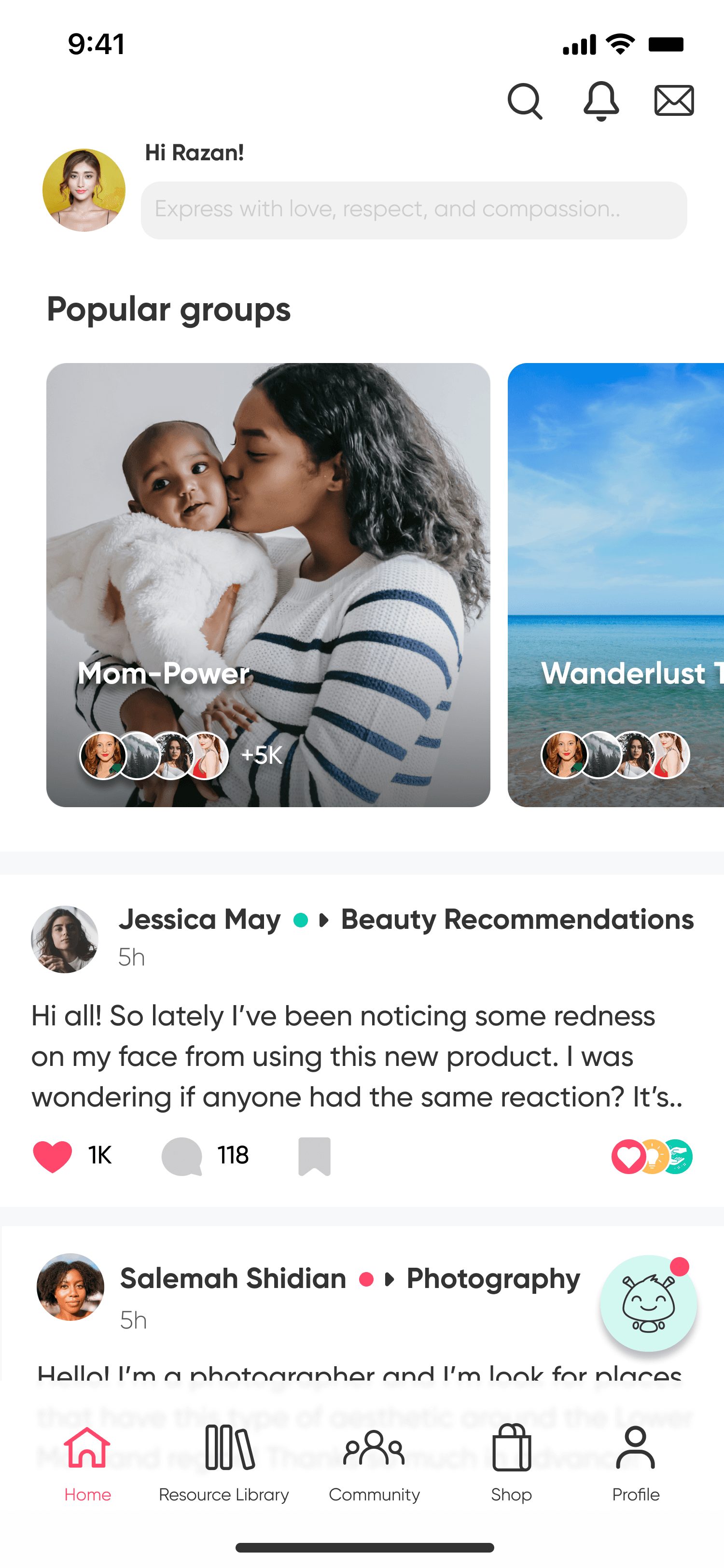
The basic design came together quickly. From my competitive analysis, I knew that additional chatbot features such as goal-setting and mood tracking are commonly used to increase user engagement. This aligned with my user research, which showed that users would benefit from interactive tools within the chat. I decided to include an activity icon within the chat and used low-fidelity wireframing to visualize a few different variations.

Branding & UI Design
While InPower already has established branding in place, my team and I were tasked with developing the chatbot UI, including the chatbot name and icon. Based on our user research, we knew that users distrust chatbots that are too personified and dislike AI that mimics humans too closely. Keeping this in mind, we knew that our chatbot icon needed to be uniquely bot-like while still being friendly and approachable.
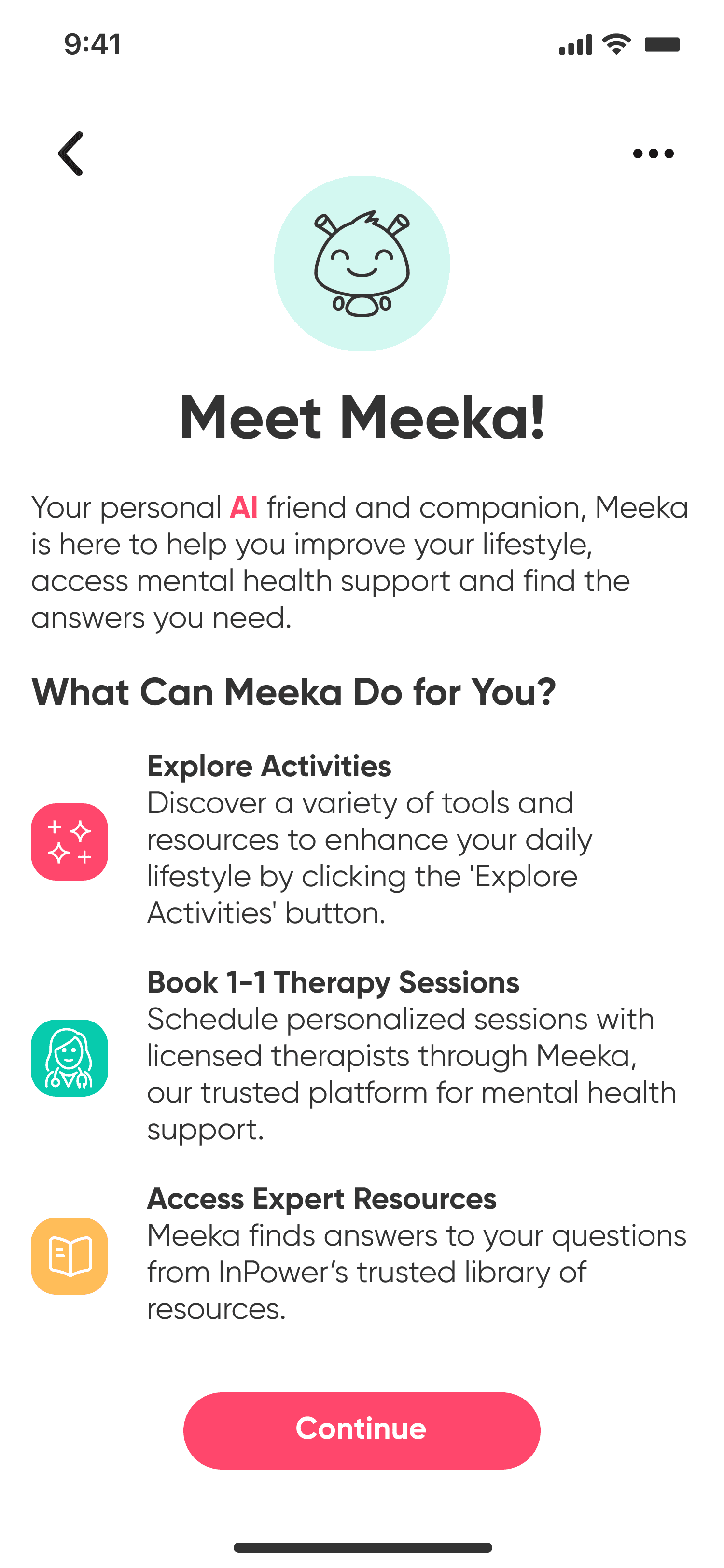
While brainstorming icons, we also explored potential names for our chatbot. During a meeting with our stakeholders, InPower’s founder and CEO expressed wanting a name that was both unique and meaningful. She loved the idea of naming the bot after her friend and inspiration, Dominique, but struggled to find a way to adapt it into a fitting name for the chatbot.
Meet Meeka!
My team was left to do some thinking. We wanted a name that was cute and fun, especially for InPower’s younger target market, but also wished to find a way to make our client happy. While researching alternative names for Dominique, we discovered the nickname ‘Meeka.’ It was cute, friendly and uniquely meaningful to our client. Thus, Meeka was born!

Developing high-fidelity wireframes
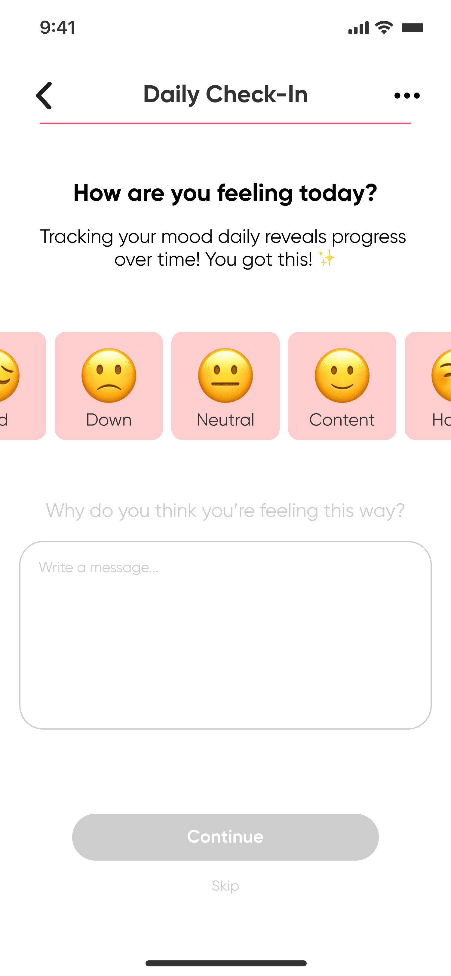
With Meeka starting to evolve, my team and I began the process of high-fidelity wireframing. We created the main chat flow and then focused our attention on various interactions users could experience within the chatbot. My focus was on creating the activities icon pop-up, as well as the daily check-in flow. From there, I was able to prototype and prepare for usability testing. Take a sneak peek below or view the high-fidelity wireframes here.

Test
Conducting usability testing
With my prototype ready, it was time to test. Each member of my team conducted usability testing with five participants in an effort to evaluate how effectively users are able to navigate the chatbot UI and engage with our key interactions.
Methodology
The usability testing platform Lyssna was used to host the tests and interviews were conducted both in person and virtually via Zoom.
Users were asked to independently perform each task to the best of their abilities while I observed their interactions. After each task, I engaged them in conversation to discuss their overall thoughts and any frustrations.