Nomad Hub
Designed to help expats meet new people, make friends and find community.
Designed to help expats meet new people, make friends and find community.

Project
End-to-End Mobile App Design
Role
UX|UI Designer
Duration
Six Weeks
Scope
UX Research, Strategy, Information Architecture, Interaction Design, Wireframing, Visual Design, Branding, Prototyping, Usability Testing, Iterations
Tools
Figma, Miro, Optimal Workshop, Whimsical, Lyssna
Overview
Designed for the ever-growing community of digital nomads and expats, Nomad Hub reimagines how people connect and create a sense of home abroad. Developed over six weeks, it combines research-driven insights, strategic design and thoughtful branding to deliver a platform that fosters meaningful connections and enriches the nomadic experience.
Designed for the ever-growing community of digital nomads and expats, Nomad Hub reimagines how people connect and create a sense of home abroad. Developed over six weeks, it combines research-driven insights, strategic design and thoughtful branding to deliver a platform that fosters meaningful connections and enriches the nomadic experience.
Problem
Moving abroad can be exciting, but it often comes with loneliness and uncertainty.
Moving abroad can be exciting, but it often comes with loneliness and uncertainty.
Solution
Nomad Hub was designed to bridge that gap, giving expats and digital nomads a way to find each other, make connections and build friendships wherever they call home.
Nomad Hub was designed to bridge that gap, giving expats and digital nomads a way to find each other, make connections and build friendships wherever they call home.
Research
Diving into the problem space
According to the Association of Americans Resident Overseas (AARO), at least 5.4 million Americans currently live abroad. Globally, millions of people move abroad each year for a multitude of reasons. With the rise of remote work and the digital nomad era, this number is only going to continue to climb. With such high numbers, I was curious to know what drives people to move abroad and wanted to understand what pain points they experience in the process. A mix of competitive analysis and user interviews helped me dive further into the problem space.
Understanding the user
My goal was to understand the motivations, problems and experiences of millennials and Gen Zers who have moved abroad, in an effort to better understand where their frustrations lie. This was crucial in order to define the problem and design the solution.
Comparative reserach and competitive analysis
With such a large number of people living abroad, I expected there to be a number of resources already available in order to help users with the transition. I conducted a competitive analysis to assess what is already on the market and comparative research to see where there is room for improvement.
Key Insights
Key Insights
The closest competitor, InterNations, claims to have a large expat community, but the majority of members appear to be either professional expats who relocated for business or older expats not within my target market. This was promising, as I was starting to see a definite gap in the market for a comprehensive digital solution aimed at millennial and Gen Z expats. I was curious to find out more in my user interviews.
The closest competitor, InterNations, claims to have a large expat community, but the majority of members appear to be either professional expats who relocated for business or older expats not within my target market. This was promising, as I was starting to see a definite gap in the market for a comprehensive digital solution aimed at millennial and Gen Z expats. I was curious to find out more in my user interviews.
User Interviews
User Interviews
In order to get better acquainted with the problem space in relation to my target market, I conducted several interviews via video call with millennials who have had multiple experiences moving to new countries while in their 20s and 30s.
The user interviews revealed 3 key insights:
In order to get better acquainted with the problem space in relation to my target market, I conducted several interviews via video call with millennials who have had multiple experiences moving to new countries while in their 20s and 30s.
The user interviews revealed 3 key insights:
Participants mentioned feelings of loneliness and noted how challenging it was building new friendships and finding genuine connections.
Finding housemates that are good matches can be difficult and adds to the stress of moving somewhere new.
Financial concerns with moving to a new country caused large amounts of stress and worry during the process.
User Quotes

"I was really lonely for many months when I was there. And I had to just suck it up and kind of start doing things by myself. Eventually I ended up finding friends through other ways."

"If I were to move again, it would be a bit harder for me to get into a community because I'm getting a bit too old for backpacking. So my biggest concern would be meeting people. I don't know how I would be able to meet people."

"I do remember housing was one of the biggest challenges as well. Finding a roommate that is a good match can be pretty difficult. I feel like I got lucky, but I do know that it is not an easy thing."

"When you move to a new country, you spend a lot of money upfront, trying to get yourself set up and sorted, so the initial waiting period for your first paycheck to come through can be quite frustrating."
"I was really lonely for many months when I was there. And I had to just suck it up and kind of start doing things by myself. Eventually I ended up finding friends through other ways."
"If I were to move again, it would be a bit harder for me to get into a community because I'm getting a bit too old for backpacking. So my biggest concern would be meeting people. I don't know how I would be able to meet people."
"I do remember housing was one of the biggest challenges as well. Finding a roommate that is a good match can be pretty difficult. I feel like I got lucky, but I do know that it is not an easy thing."
"When you move to a new country, you spend a lot of money upfront, trying to get yourself set up and sorted, so the initial waiting period for your first paycheck to come through can be quite frustrating."
Define
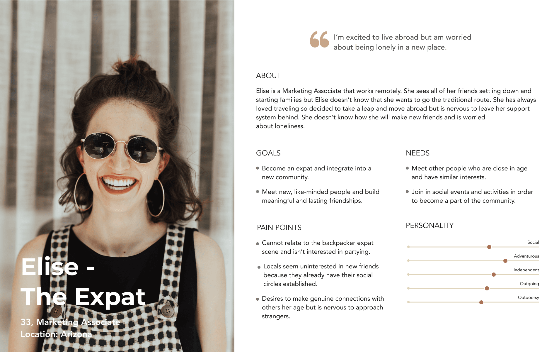
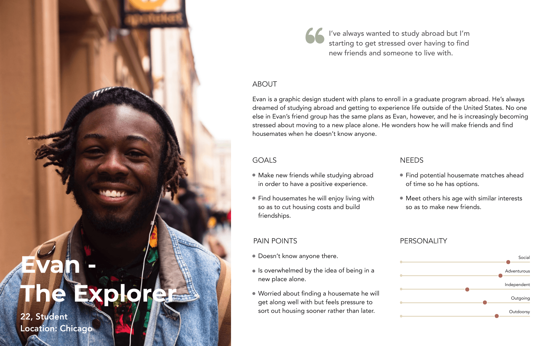
Building user empathy
My competitive analysis and user interviews provided me with a better understanding of who my users are and what problems they face as expats. In an effort to turn my research findings into concrete visualizations, I created two user personas to help me empathize with my users and understand their needs. Meet our users:
POVs & HMWs
Now that I could visualize my users and empathize with their issues, I wanted to create a point-of-view statement and how-might-we question that would help me clarify the key problem and focus on designing to meet my user’s needs.
Now that I could visualize my users and empathize with their issues, I wanted to create a point-of-view statement and how-might-we question that would help me clarify the key problem and focus on designing to meet my user’s needs.
POV:
I’d like to explore ways to help expats build community, make friends and find housemates because settling into a new place can feel isolating, and building social connections can be challenging.
HMW:
How might we connect like-minded expats with friends, community and housing opportunities to make settling into a new city feel easier and less stressful?
Ideate
Roadmapping product features
With my POV and HMW question highlighting the problem, it was time to start strategizing. Keeping my research in mind, I created a product feature roadmap, which ranked features from high to low priority and helped inform design decisions. View below or access the feature roadmap here.
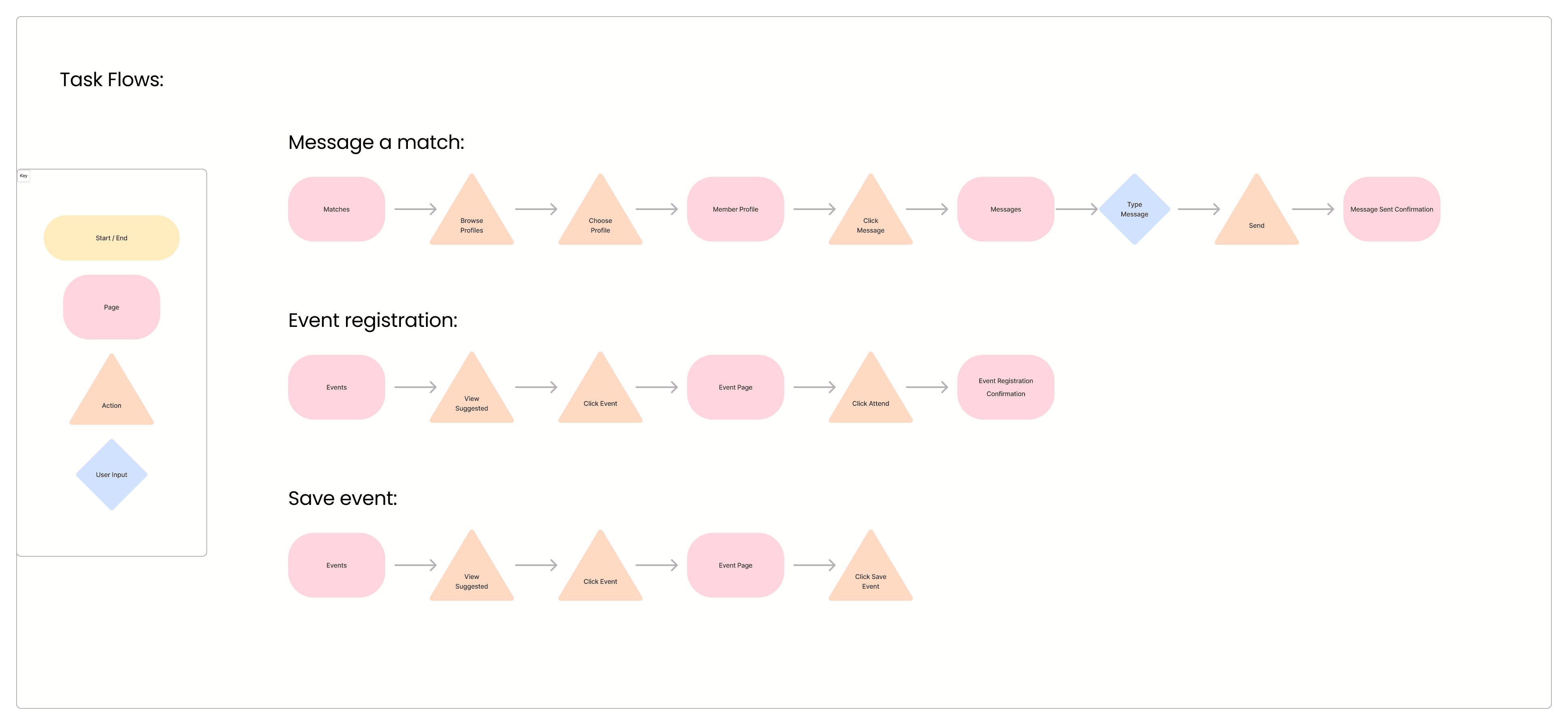
Mapping out user and task flows
With a better understanding of my users, my priority features and the hierarchy of my content, I started sketching out user flows and task flows to better understand how a user would navigate the website, complete various tasks and what they might do if confronted with any potential roadblocks. Below are task flows that show three tasks a user may complete while engaged with the app. Click here to see the user flow in more detail.
Design
Creating key screens
Finally it was time to start creating my key screens. I started by sketching out the concepts in low-fidelity, then moved to Figma to create mid-fidelity wireframes. View all mid-fidelity wireframes here.
Branding & UI design
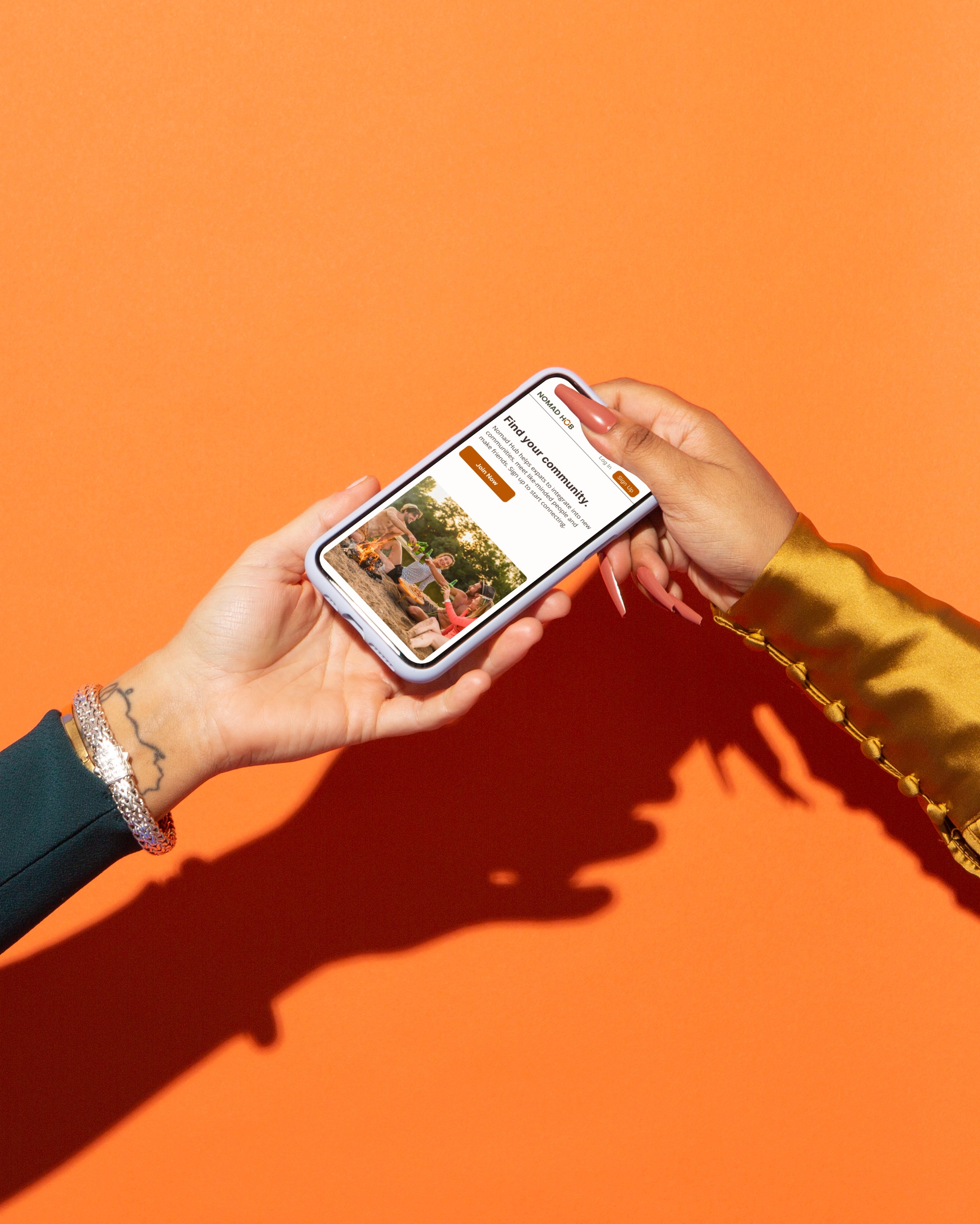
While brainstorming a name for the product, I knew I needed to keep my research and user personas in mind. The idea of an expat, or digital nomad, in search of community led me to the name Nomad Hub.
A hub represents a central point of connection, a place where people, ideas and resources come together. In many ways, community functions the same way in our lives. It is the core around which belonging, support and fulfillment are built. The name Nomad Hub reflects the product’s purpose: to serve as a central digital gathering place where nomads can find connection, support and a sense of home wherever they are.
From there, I created a mood board using my brand keywords as inspiration:
Connection - Finding genuine connection with others through real-life experiences in order to feel fulfilled.
Community - Building a community in a home away from home in order to feel a part of something, a sense of belonging.
Exploration - For those who seek experiences and are curious about the world.
Contentment - The feeling of happiness and fulfillment from living a full life and having meaningful friendships/relationships.
Adventure - For those who want more out of life and are willing to go looking for it.

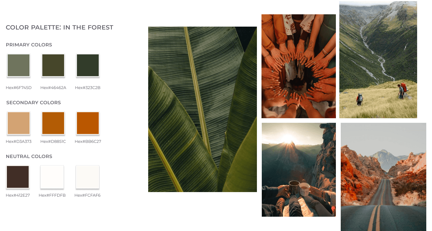
Guided by my mood board and brand keywords, I developed my color palette.
The palette is inspired by colors found in nature and is made up of warm, earthy tones. The green hues represent a fresh start and growth, which is aligned with Nomad Hub’s values of connection, exploration and building community. The oranges bring out the feelings of sunshine, warmth and happiness. The colors together represent adventurous days hiking mountains or getting lost in the forest.
Creating a logo
With my colors defined, I turned my attention to creating the logo. After several iterations, I arrived at a finalized design that subtly weaves meaning into the typography. The “U” in Hub is transformed into a simple home icon, symbolizing shelter, belonging and stability. By embedding this visual directly into the word, the logo reinforces the Nomad Hub's mission to create community and a sense of home for people who are always on the move.

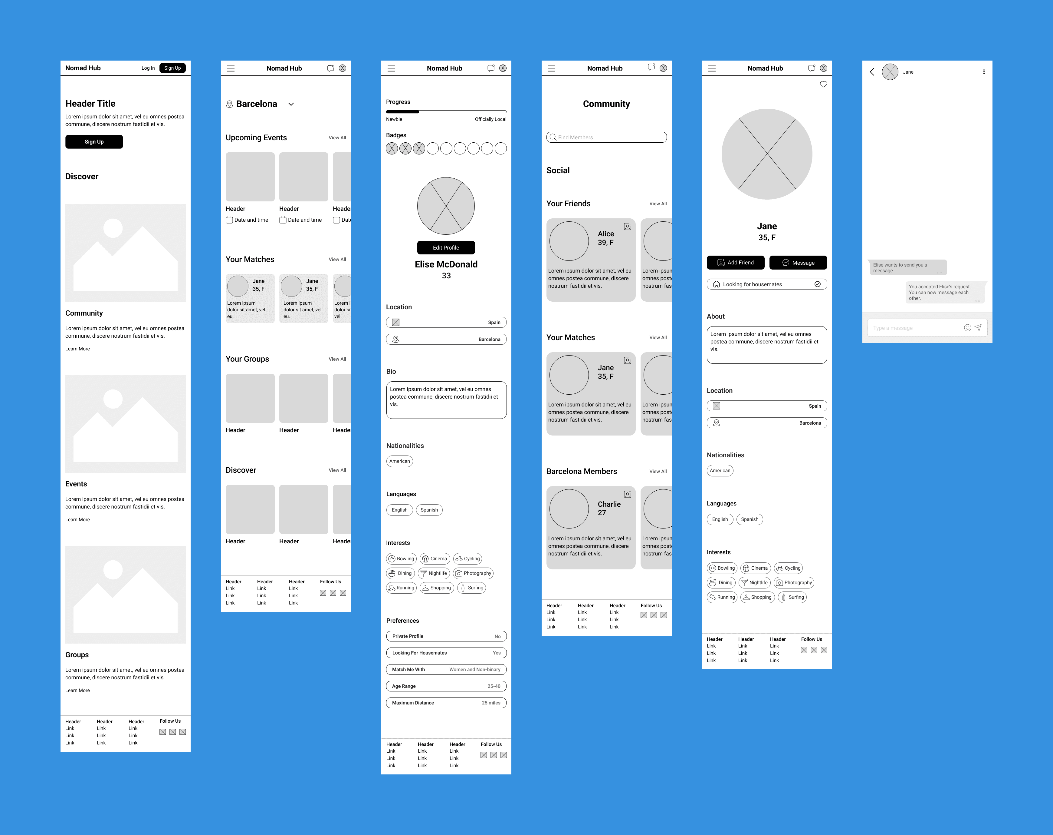
Building the prototype
With my branding in place, I brought my wireframes from mid-fidelity to high-fidelity by incorporating my logo, colors, icons and typography. From there, I was able to build the prototype and prepare for usability testing. Have a look below or view the high-fidelity wireframes here.
Getting started
Users are able to join Nomad Hub by signing up for an account and completing the onboarding process. This helps to build their profile and sets them up for success with finding matches so they can start making connections and integrating into their new community.
Editing profile preferences
Once users create an account, they can update their profile and preferences at any time. They can also track their progress as they go from ‘newbie’ to ‘officially local’ by earning badges for completing certain activities, such as messaging a match or registering for an upcoming event.
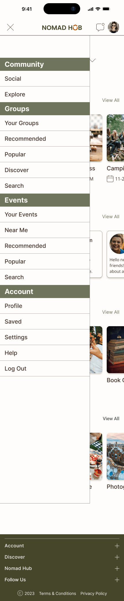
Messaging matches
From the home screen or community page, users can view personalized match suggestions based on shared interests, location, and preferences. From there, they can explore each profile and choose to add someone as a friend or start a conversation. It just might be the start to a beautiful friendship!
Getting started
Users are able to join Nomad Hub by signing up for an account and completing the onboarding process. This helps to build their profile and sets them up for success with finding matches so they can start making connections and integrating into their new community.
Editing profile preferences
Once users create an account, they can update their profile and preferences at any time. They can also track their progress as they go from ‘newbie’ to ‘officially local’ by earning badges for completing certain activities, such as messaging a match or registering for an upcoming event.
Messaging matches
From the home screen or community page, users can view personalized match suggestions based on shared interests, location, and preferences. From there, they can explore each profile and choose to add someone as a friend or start a conversation. It just might be the start to a beautiful friendship!
Test
Usability testing to gather feedback
With my prototype ready, it was time to test. I conducted a usability test with five participants in order to evaluate the ease of use and navigation and identify any usability issues within the platform. I wanted to understand the user’s overall experience and what they liked or disliked about Nomad Hub, as well as gather feedback for improvements.
Methodology
The usability testing platform Lyssna was used to host the tests and interviews were conducted both in-person and virtually via Zoom.
Users were asked to independently perform each task to the best of their abilities while I observed their interactions. Users were asked to rate the ease of use, user satisfaction and provide feedback about the specific tasks.
Concepts Tested
Concepts Tested
Are users able to easily sign up for an account and complete the onboarding process?
Are users able to easily sign up for an account and complete the onboarding process?
Can users access and edit their profile to show that they are looking for housemates?
Can users access and edit their profile to show that they are looking for housemates?
Can users find the Community Social page easily from the menu?
Can users find the Community Social page easily from the menu?
Are users able to successfully message a match?
Are users able to successfully message a match?
Results & Recommendations
Result
The Community Social page was not clearly distinguishable.
Recommendation
Relocate the sub-header "Social" to make it more prominent on the Community Social page.
Result
The friends and matches sections on the Community Social page were not immediately visible, requiring users to scroll before discovering them.
Recommendation
Adjust the spacing of the search bar and other elements on the Community Social page.
Result
Users experienced some confusion and would benefit from clearer guidance within the drop-down menu.
Recommendation
Simplify the drop-down menu so that each section remains consistent and provides clear navigation.
Design Iterations
After reviewing my usability test results, I focused on key iterations to improve the overall design. These changes improved the clarity of the Community Social page navigation and made key features easier to discover, helping users more quickly connect with friends and matches.
Improved Discoverability
The Social subheader was repositioned to sit more prominently under the Community header. This change makes the page easier to identify and improves discoverability within the navigation.

Layout & Spacing
Repositioning the Social subheader and moving surrounding elements upward reduced excess space, allowing the Your Friends section and the beginning of Your Matches to appear immediately on screen, reducing the need for scrolling.
Navigation Consistency
Updating the Social subheader improves alignment between the page structure and the drop-down menu. This creates a clearer and more intuitive navigation experience for users.

Improved Discoverability
The Social subheader was repositioned to sit more prominently under the Community header. This change makes the page easier to identify and improves discoverability within the navigation.
Layout & Spacing
Repositioning the Social subheader and moving surrounding elements upward reduced excess space, allowing the Your Friends section and the beginning of Your Matches to appear immediately on screen, reducing the need for scrolling.
Navigation Consistency
Updating the Social subheader improves alignment between the page structure and the drop-down menu. This creates a clearer and more intuitive navigation experience for users.
Results & Recommendations
Result
The Community Social page was not clearly distinguishable.
Recommendation
Relocate the sub-header "Social" to make it more prominent on the Community Social page.
Result
The friends and matches sections on the Community Social page were not immediately visible, requiring users to scroll before discovering them.
Recommendation
Adjust the spacing of the search bar and other elements on the Community Social page.
Result
Users experienced some confusion and would benefit from clearer guidance within the drop-down menu.
Recommendation
Simplify the drop-down menu so that each section remains consistent and provides clear navigation.
The final prototype
After extensive research, strategy, design, testing and iteration, Nomad Hub is ready for its close-up!
Explore the high-fidelity prototype below and step into a platform designed to help expats build meaningful connections, find community and feel more at home wherever they are.
Design Iterations
After reviewing my usability test results, I focused on key iterations to improve the overall design. These changes improved the clarity of the Community Social page navigation and made key features easier to discover, helping users more quickly connect with friends and matches.
Improved Discoverability
The Social subheader was repositioned to sit more prominently under the Community header. This change makes the page easier to identify and improves discoverability within the navigation.
Layout & Spacing
Repositioning the Social subheader and moving surrounding elements upward reduced excess space, allowing the Your Friends section and the beginning of Your Matches to appear on screen without the need for scrolling.
Navigation Consistency
Updating the Social subheader improves alignment between the page structure and the drop-down menu.
This creates a clearer and more intuitive navigation experience for users.
The final prototype
After extensive research, strategy, design, testing and iteration, Nomad Hub is ready for its close-up!
Explore the high-fidelity prototype below and step into a platform designed to help expats build meaningful connections, find community and feel more at home wherever they are.
Reflection
Reflection
Final Thoughts
This was my first end-to-end UX/UI design project, and although conceptual, I grew to really enjoy the process of designing Nomad Hub and found the experience both rewarding and educational. Working through each stage of the design process, from research and ideation to prototyping and testing, helped me better understand how thoughtful design decisions shape user-centered products and strengthened my ability to translate research insights into intentional design solutions.
Key Takeaways
Expand the research pool when possible
Since this project was conceptual and created for learning purposes, the research pool was limited. In a real-world scenario, I would aim to include a broader and more diverse group of participants to gather a wider range of insights.
Low- and mid-fidelity prototypes don't need to be pixel perfect
When working with early-stage prototypes, speed and clarity are often more important than visual precision. While high-fidelity designs should be polished, lower-fidelity prototypes are most valuable when they allow for quick iteration and feedback.
Leverage familiar design patterns
Using established design patterns can help reduce design complexity and improve usability, since users are already familiar with how these interactions work.
Stay organized throughout the design process
UX projects involve many moving parts, from research to iterations and testing insights. Maintaining a clear and organized workflow makes it easier to manage progress and keep the project moving forward.
Nomad Hub challenged me to think critically, design intentionally and approach each decision with empathy. Through this process, I gained confidence guiding a product from concept to prototype and deepened my passion for designing thoughtful, community-centered experiences.