Our Place Studio

Designing a seamless user experience.

Weather app image
Weather app image
Weather app image
Weather app image
Weather app image
Weather app image
Weather app image
Weather app image
Weather app image
ROLE

UX/UI Designer
& Researcher

TOOLS

Figma, Adobe Illustrator, Lyssna

DURATION

Four
Weeks

Overview

Our Place Studio is a popular yoga and fitness studio that has been in business for over 20 years. Their unique selling point is that they offer aerial yoga, along with a variety of other styles of fitness, such as small group training, Pilates and more.

For this project, I set out to redesign Our Place Studio’s website to create a more cohesive, minimalist, and user-friendly experience. My goal was to rebrand the studio in a way that aligns with business objectives while prioritizing user needs. Read on to explore my journey in crafting a responsive website for Our Place Studio.

Problem

While Our Place Studio has established itself as a successful business, their website currently fails to showcase their full potential. While they do provide some general information, their site navigation and UI design offer significant room for improvement. Additionally, the lack of an online booking system could lead to a loss of potential customers, ultimately limiting future growth.

Goal

The goal of this project is to elevate an existing website by updating the web design to be responsive with a cleaner layout and minimalist aesthetic. This includes clearer site navigation, an online booking platform and brand refresh.

Ready to jump ahead?

Click below to view the prototype.

Research

Research

Research

Researching the competition with a competitive analysis

My research began with a competitor analysis to assess the current market. By examining the strengths and weaknesses of other local studios, I was able to better understand Our Place Studio’s position and identify opportunities for improvement.

Key Insights:

Key Insights:

Chatting with the yoga community to gain deeper insights

With a clearer understanding of the competitive landscape, my next step was to gain deeper insights into user needs and behaviors. I conducted user interviews with a diverse group of yogis in order to learn what expectations they have when visiting yoga studio websites. I wanted to understand how they choose a studio, their preferred booking method and what factors encourage them to become long-term studio members. Here is what I learned:

With a clearer understanding of the competitive landscape, my next step was to gain deeper insights into user needs and behaviors. I conducted user interviews with a diverse group of yogis in order to learn what expectations they have when visiting yoga studio websites. I wanted to understand how they choose a studio, their preferred booking method and what factors encourage them to become long-term studio members. Here is what I learned:

Inclusivity & Diversity

Users prioritize studios that cultivate an inclusive and welcoming environment. Diversity that is represented in staff photos, teacher bios, and class imagery helps foster a sense of inclusivity and allows users to see themselves as valued members of the community.

Studio Philosophy & Culture

Unlike with other fitness studios, users look for something deeper and seek a balance between physical practice and spiritual mindfulness when it comes to yoga. Users look for an authentic space grounded in meaningful values when searching for a studio.

Community & Connection

A strong sense of community encourages long-term engagement, with events, workshops, and social gatherings helping users feel more connected to the studio. Additionally, a strong social media presence showcases the studio's culture and reinforces community ties.

Booking & Website Expectations

Users prefer the convenience of booking directly through the studio’s website for a seamless experience. Detailed class descriptions, intensity levels, and beginner-friendly options help users make informed choices, while comprehensive studio information, such as pricing, policies and schedules, ensures an effortless booking experience.

Actionable Insights

These insights highlight the importance of designing a website that reflects Our Place Studio’s values while meeting user expectations for inclusivity, community, and ease of use.

Define

Define

Define

Developing a user persona to better understand user goals and frustrations

With my user research helping me to better understand and empathize with my users, I developed a user persona to represent Our Place Studio’s members, as well as the broader yoga community. Meet Josie the Yogi! Josie is 34 years old and lives a busy, stressful life. She has recently discovered yoga and loved the way it helped calm her anxious mind.

Her main goal is to find a nearby yoga studio that offers a variety of classes and embraces both the spiritual and physical aspects of the practice. She dreams of finding a studio with a strong sense of community where she feels valued as a member. With her busy schedule, she depends on studio websites to provide detailed information and expects a seamless booking experience.

Brainstorming solutions based on research insights

Guided by my user persona, I identified three key problem statements for this project, each prompting me to explore "how might we" solutions to address user frustrations, motivations and goals.

Guided by my user persona, I identified three key problem statements for this project, each prompting me to explore "how might we" solutions to address user frustrations, motivations and goals.

Prioritizing solutions by analyzing business goals and user needs

Before delving further into this project, I wanted to take some time to reflect on the goals of both Our Place Studio as a business and those of prospective users, considering both their differences and how they align. These goals will serve as a foundation for future product development, guiding feature selection and ensuring the website meets both user needs and business objectives.

Before delving further into this project, I wanted to take some time to reflect on the goals of both Our Place Studio as a business and those of prospective users, considering both their differences and how they align. These goals will serve as a foundation for future product development, guiding feature selection and ensuring the website meets both user needs and business objectives.

Ideate

Ideate

Ideate

Considering product features to enhance the user experience

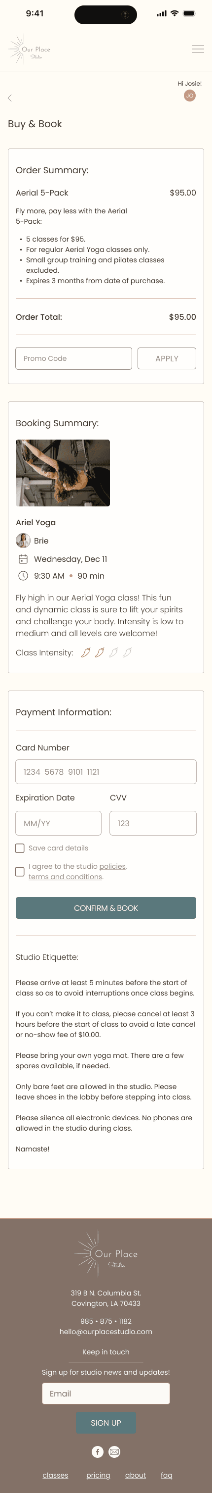
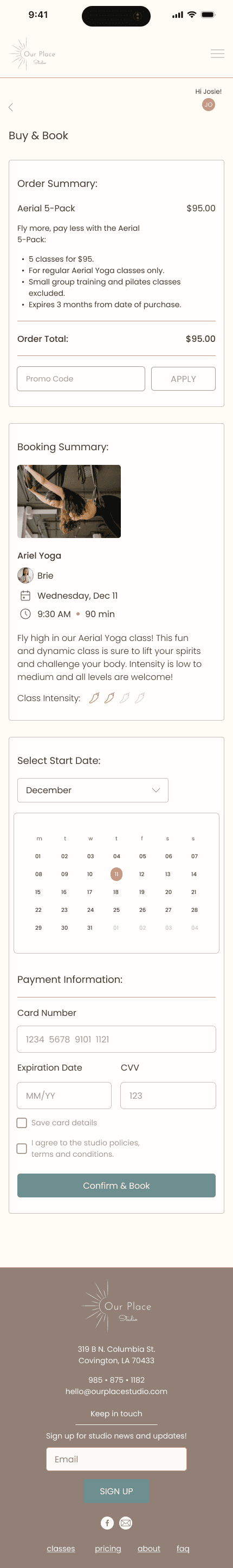
With my project goals in mind, it was time to focus on product features. Each feature was thoughtfully designed to enhance the user experience while aligning with both user needs and business objectives. View below or access the feature roadmap here.

Visualizing the user journey with a user flow

Next, I created a user flow to visualize the journey of booking a class on Our Place Studio’s website. This flow maps out each step, from viewing the weekly schedule to selecting a pricing plan, highlighting the different paths users may take throughout the process. Click here to see the user flow in more detail.

Design

Design

Design

Starting the design phase with low & mid-fidelity wireframes

With a clear understanding of my users and the class booking journey, it was time to begin the design phase. For my low-fidelity wireframes, I stuck to pencil and paper, sketching out ideas and formulating a basic concept. Once this was established, I progressed to mid-fidelity wireframes and moved on to user testing. Check out the mid-fidelity wireframes here.

Validating the user flow and refining concepts with mid-fi usability testing

Before moving to hi-fi, I wanted to do a quick usability test with my mid-fi wireframes to get feedback on functionalities and the user flow. I tested five users on the main flow of booking a class through the online booking platform with the following results:

Thinking fresh with a brand redesign

From the start of this project I knew I wanted to provide a brand refresh for Our Place Studio. During my research, I asked the yogis I interviewed what yoga means to them. From their responses, I was able to hone in on some keywords that came together to create a common theme. Using these keywords, I crafted a mood board to capture the essence of yoga and serve as inspiration for Our Place Studio’s branding.


Guided by my mood board and brand keywords, I developed a color palette rooted in neutral, cool tones with shades of blue, pink and brown. The blues evoke serenity and tranquility, while the dusty pink and warm browns add a touch of cheerfulness, reflecting strength and the playful side of yoga. My goal was to capture the studio’s calm, peaceful atmosphere while also conveying its vibrant community spirit.


Color Psychology:

Blue: Calm, trust, reliability, serenity

Pink: Care, tranquility, approachability

Brown: Earthiness, stability, warmth

White: Cleanliness, purity, simplicity

Designing a new logo

The original Our Place Studio logo features the infinity symbol, which, in yoga, represents the continuous journey of growth, self-discovery and the interconnectedness of mind, body and spirit.

Inspired by this theme, I wanted to create something with equally symbolic meaning. After some research, I landed on the Sun, which in yoga represents willpower, vitality and courage in life. The Sun also represents rebirth and new beginnings — an ideal representation of Our Place Studio’s rebrand.


Though I had fun playing with various logo designs, ultimately I chose to go with the top left logo as the more accessible option.

Bringing it all together with high-fidelity wireframes

With my logo and branding in place, I began the process of high-fidelity wireframing. With the addition of color, text and imagery, Our Place Studio’s reimagined website was starting to come to life. See below or view the full high-fidelity wireframes here.

Test

Test

Test

A second round of usability testing to further evaluate strengths & weaknesses

After completing my high-fidelity wireframing and prototyping, I carried out a second usability test to further evaluate the strengths and weaknesses of the project. The goal was to determine how well users can navigate the website and booking platform, while evaluating which areas are in need of improvement.

Methodology

The usability testing platform Lyssna was used to host the tests, and interviews were conducted both in person and virtually via Zoom.

Users were asked to independently perform each task to the best of their abilities while I observed their interactions. Users were asked to rate the ease of use, user satisfaction and provide feedback about the specific tasks.

Concepts Tested:

Concepts Tested:

If users are able to navigate the website and find the Aerial Yoga class.

If users are able to navigate the website and find the Aerial Yoga class.

If users can successfully purchase a new class package and book a class.

If users can successfully purchase a new class package and book a class.

If users find the website informative and easy to use.

If users find the website informative and easy to use.

If users find the booking process satisfying & delightful.

If users find the booking process satisfying & delightful.

Results:

Quotes:

Recommendations:

Refining the design with recommended iterations

After reviewing my usability test results, I focused on refining the design by implementing the following iterations:

Results

The final prototype

After completing iterations and final refinements, Our Place Studio’s responsive website is officially finished! The new website embodies the studio’s philosophy and aligns with user needs and business goals, all while delivering a seamless and trusted booking experience.

Check out the high-fidelity prototype below, or click here to take a look at the finalized screens.

Recommendations:

Quotes:

Refining the design with recommended iterations

After reviewing my usability test results, I focused on refining the design by implementing the following iterations:

The final prototype

After completing iterations and final refinements, Our Place Studio’s responsive website is officially finished! The new website embodies the studio’s philosophy and aligns with user needs and business goals, all while delivering a seamless and trusted booking experience.

Check out the high-fidelity prototype below, or click here to take a look at the finalized screens.

Reflection

Reflection

Final Thoughts

As a former yoga teacher and forever yoga student, the chance to design a yoga studio website felt truly serendipitous, and I gladly accepted the challenge. Although this project was conceptual, Our Place Studio is a real business, local to my hometown. They offer all kinds of classes and are especially known for aerial yoga, which is a challenge in and of itself! Ultimately, it was such a creatively rewarding experience to reimagine the studio and create a responsive website that reflects their values while capturing the peaceful, yet playful side of yoga. While the scope of this project didn’t allow time for any additional screen designs, I would have loved the chance to have redesigned the website in its entirety. Maybe next time!

Reflection

Reflection

Final Thoughts

As a former yoga teacher and forever yoga student, the chance to design a yoga studio website felt truly serendipitous, and I gladly accepted the challenge. Although this project was conceptual, Our Place Studio is a real business, local to my hometown. They offer all kinds of classes and are especially known for aerial yoga, which is a challenge in and of itself! Ultimately, it was such a creatively rewarding experience to reimagine the studio and create a responsive website that reflects their values while capturing the peaceful, yet playful side of yoga. While the scope of this project didn’t allow time for any additional screen designs, I would have loved the chance to have redesigned the website in its entirety. Maybe next time!